Last week I posted some colored photos of the Palace of Fine Arts in San Francisco – https://dancingtothewords.com/2019/01/04/welcoming-2019/
Patti, a fellow blogger at https://pilotfishblog.com/ expressed curiosity about how these photographs might look in black and white.
I heard this as an invitation et voilà.
Some things I most enjoy about blogging: The support, feedback, exchange of ideas, and encouragement I experience between writers and photographers. I have learned so much from other bloggers and am continuously inspired by their work.
Thanks Patti
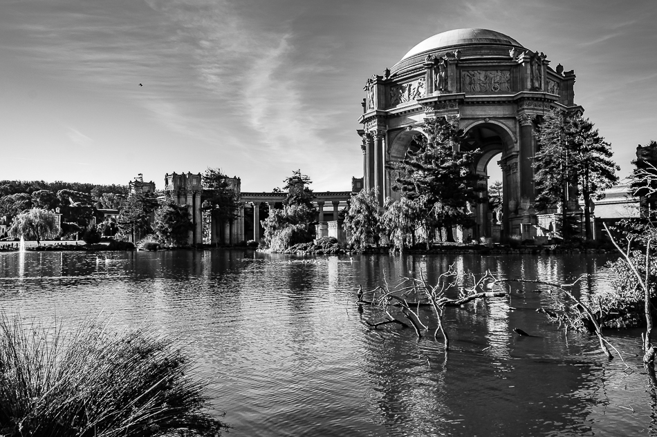
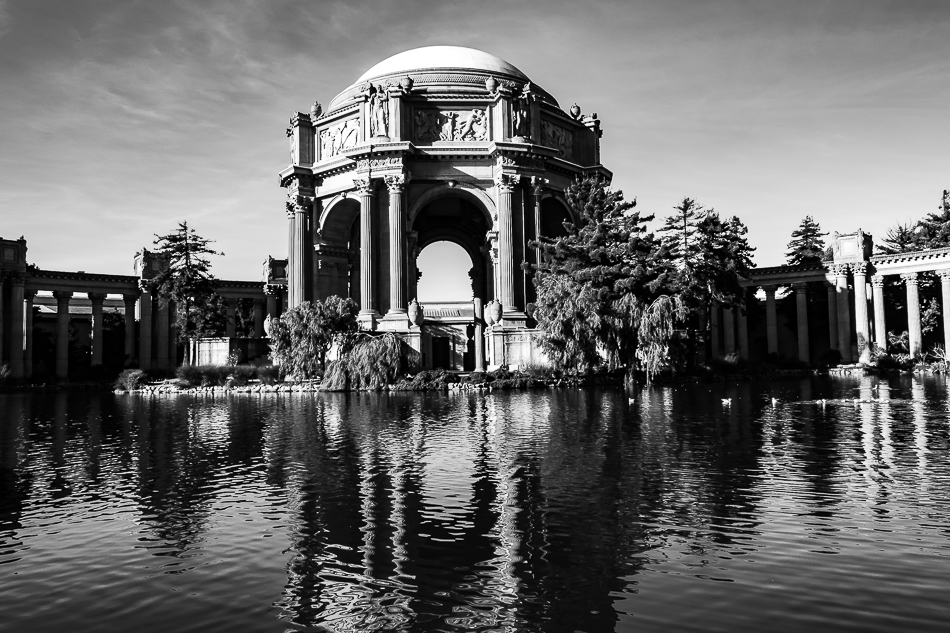
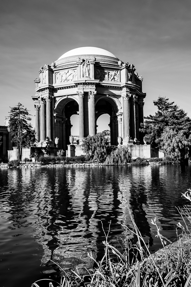
clicking on an image will open it in a separate tab


Beautiful monochrome.
LikeLiked by 1 person
Thank you Rupali
LikeLike
These are really elegant!
LikeLiked by 1 person
🙂 The building does have a certain elegance to it. Built in 1915 for the Panama Pacific Exhibition I think San Francisco was perhaps aiming for a certain European quality of elegance and stature.
LikeLike
Beautiful in monochrome, Arati. Nicely done.
LikeLiked by 1 person
Thank you
LikeLike
That really works in Black and white, Arati! I have a black and white photo of the Palace hanging around somewhere here that I took when black and white was still common, back in the early 60s. –Curt
LikeLiked by 1 person
Thanks Curt.
LikeLiked by 1 person
The black and white is striking. I really like the reflected pillars in the water.
LikeLiked by 1 person
Thank you Sandy, and yes, with this amount of contrast in the image I think b&w can really make planes pop.
LikeLiked by 1 person
I really like the composition and the alignment of the negative focal space between the central pillars of the palace. The birds in the water add to the beauty of the scene. Very striking in B/W.
LikeLiked by 1 person
Thank you Olga, I am so happy I decided to explore this image in b&w.
LikeLiked by 1 person
They look great!
LikeLiked by 1 person
🙂
LikeLike